

Volunteer Crew Website
September 2022 – october 2022
Role and Responsibilities
Project Manager, Product Owner and UX Designer leading the app and responsive website design from conception to delivery including research, interviews, design, usability studies, accessibility considerations and prototyping.
Project Summary
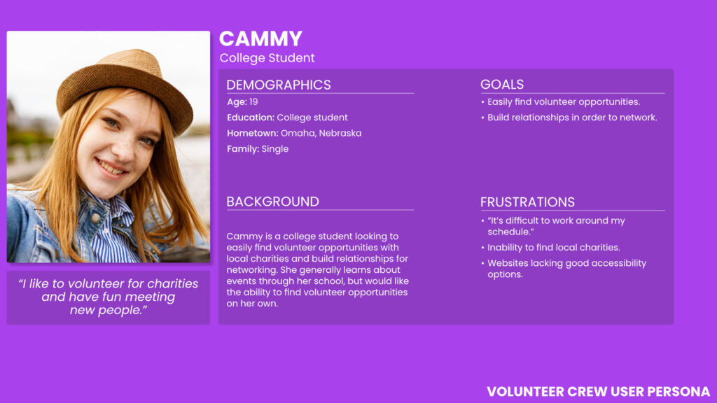
Volunteer Crew is a fictional website that allows users to easily find and register for volunteer opportunities in their area. The website aims to match volunteers, individual and groups, to find a variety of events and charities to help out.
The Challenge
Many individuals would like to volunteer their time at organizations or events that align with their personal feelings toward a subject. However, it can be difficult to find opportunities and once they are found, someone may not be able to actually attend the event due to the timing or other circumstances
How might we help a potential volunteer easily find an event to volunteer at? I created a website to allow a user to search for events by type or charity organization and then learn more with the ultimate goal of registering for the opportunity – complete with the ability to select time slots that would be most appropriate.
User Research
I conducted interviews to understand the users I’m designing for and their desires. One group of users were professionals that volunteered in the past or currently do volunteer.
This user group gave insight into their pain points of finding volunteer opportunities and what options would be useful. Participants often cited time constraints and trouble finding opportunities they could attend.
Findings indicated users would like to volunteer more often, but have trouble finding opportunities that fit their schedule due to inability to attend or the event is too long. Interviewees also mentioned not enough space for volunteering as a group, such as attending as a team from work, language barriers and other obstacles that prevent them from volunteering.
Ideation
paper wireframes
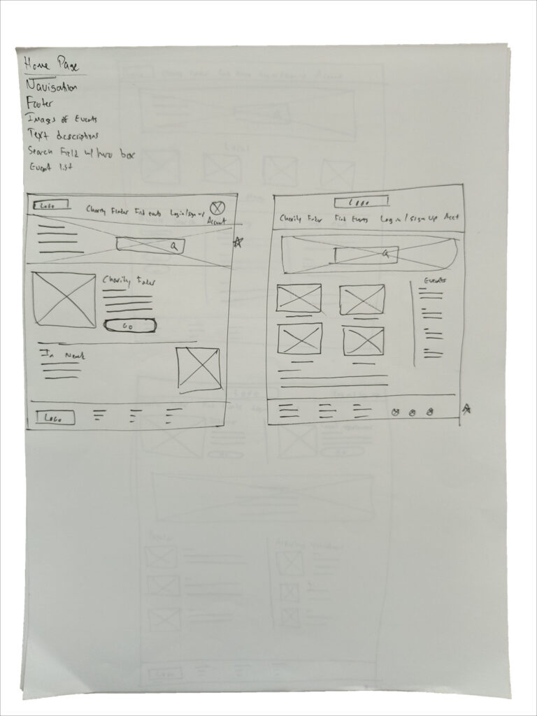
I used the Crazy Eights exercise to begin the ideation phase. By drafting screens before beginning digital wireframes, I was able to decide how to structure the website and where to place elements for usability.
Digital Wireframes
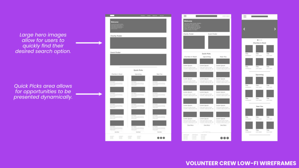
Once ideation was complete, I began to create initial designs for for the Revert app. These designs focused on ways to donate and find supplies in a local area.
Low Fidelity Prototype
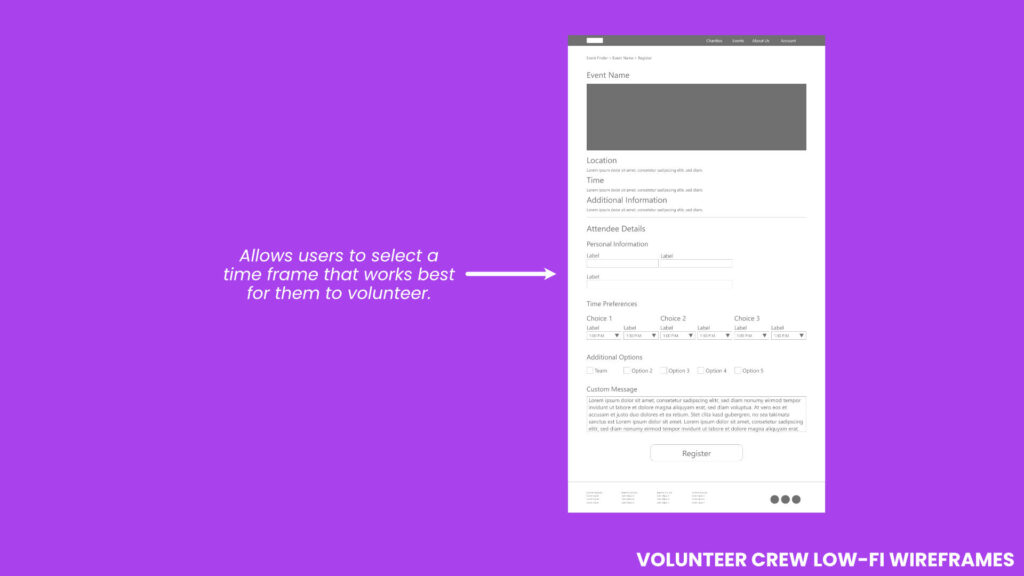
The low-fidelity prototype connected the primary user flow of finding a charity or event and successfully registering. The prototype was then utilized in a usability study.
Usability Study
I conducted four remote unmoderated usability studies with participants in Kansas on the low-fidelity prototype. Each session was approximately 15 minutes.
It was found that users value the idea of donating both old supplies and money to an organization that will use it for charity programs. Users had trouble with navigation and a few pages being confusing for non-skaters. These challenges were noted and redesigned after the study.
Accessibility Considerations
A higher contrast UI using dark backgrounds and light foreground elements to separate content and improve legibility was implemented. I opted for using accessible gestures and scrolling to include a larger range of options for users.
Mockups
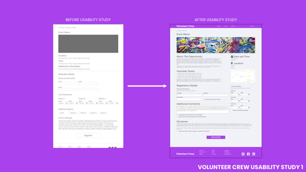
Based on insights from the usability study, I was able to improve navigation and separate pages to make the intent more clear. The donation page was confusing, but now includes a separate page explaining how the money helps.
An issue was raised during user testing about making sure supplies were being used as intended. A form was created for when users are applying for large amounts of supplies.
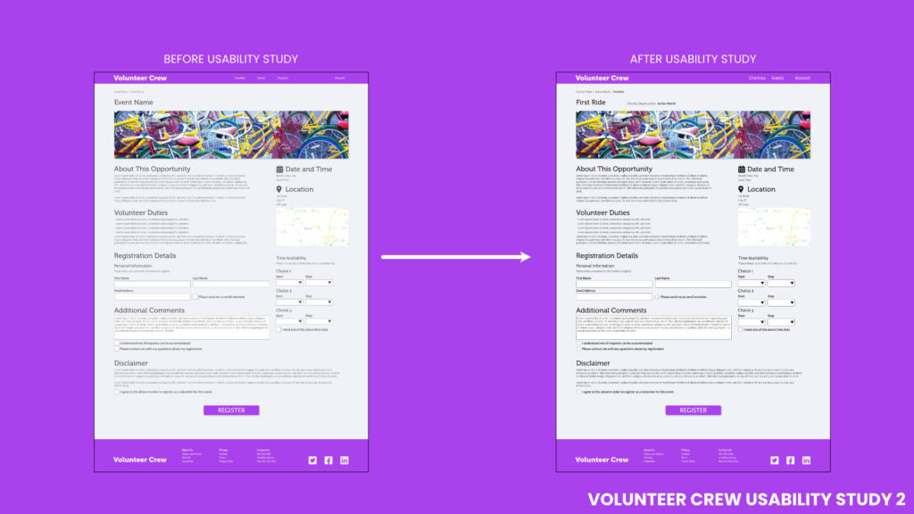
High-Fidelity Prototype
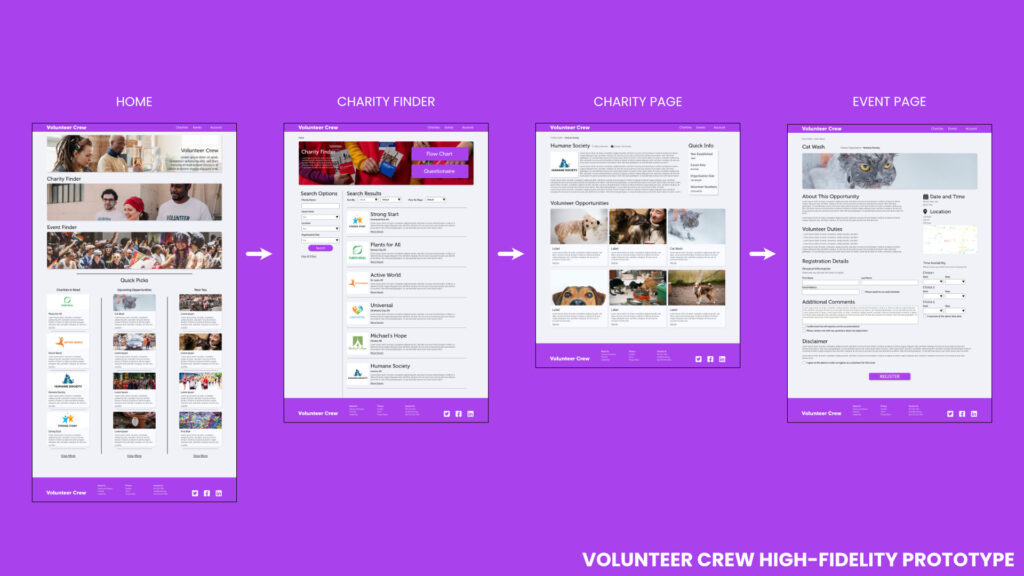
The final high-fidelity prototype featured changes found during the second usability tests. Better navigation was included to help users test.
View the Volunteer Crew High-Fidelity Prototype.
Takeaways
The website helps place volunteers with relevant opportunities in a way that is easy to understand and offers the ability to register as groups, select times and find correct opportunities. I’ve learned that responsive websites need focused attention to detail to design an experience that is usable across a variety of platforms. Image placement, text size and navigation must be legible, intuitive and appropriate to each device.
More time would have allowed for mobile phone and tablet testing, but were unavailable due to time constraints and scope of the project. A third round of usability tests would be needed to gain feedback on any pain points that may arise during the creation of other screen sizes.